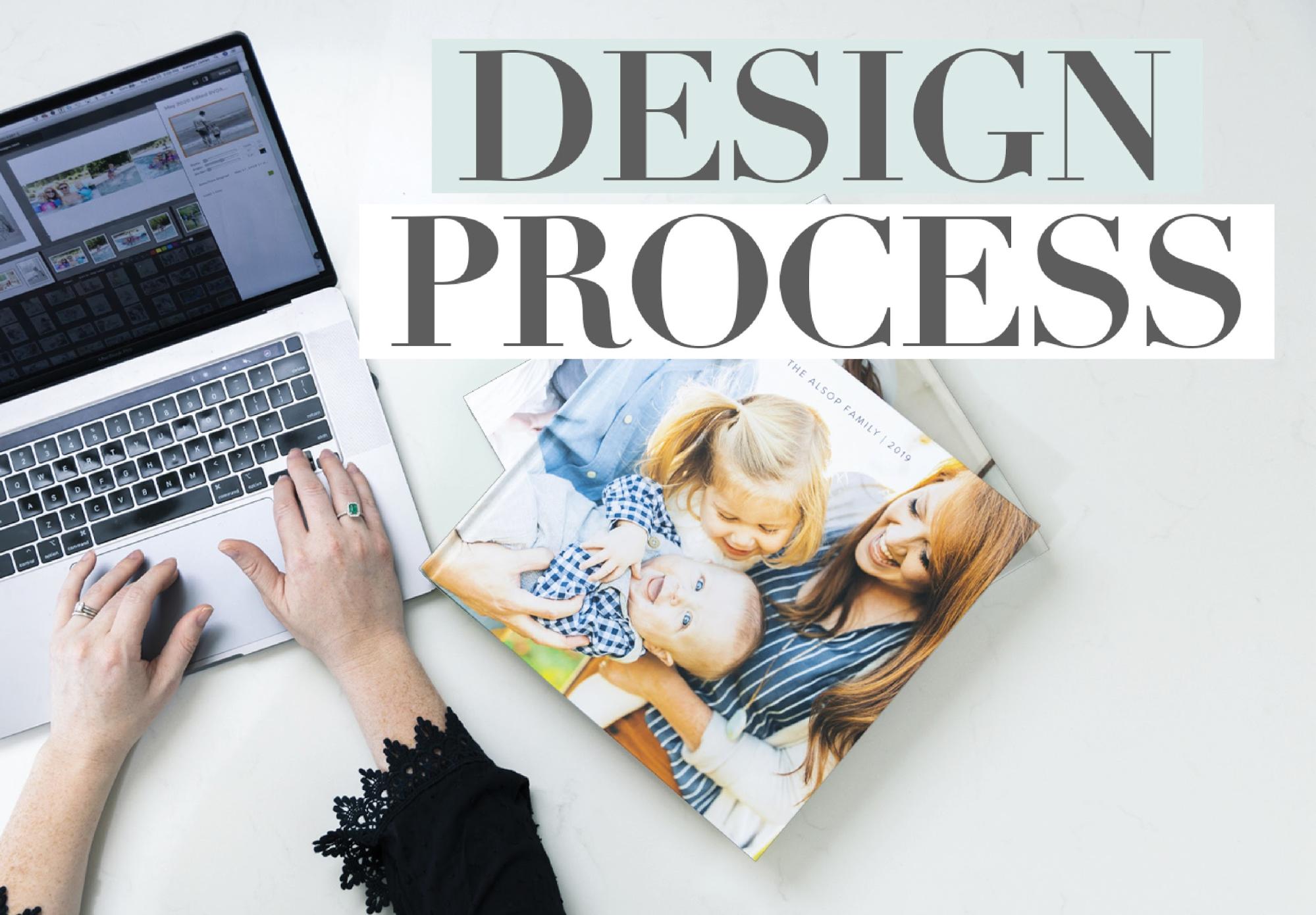
This brand new Youtube episode is dedicated to talking through HOW I actually make design decisions when it comes to my family album spreads!! How do I select which images go where? How do I find patterns and what system do I use to piece this massive project together?!
Well, before I dive in, let me first give you some stats and info on my Family Yearbook process:
- Time it takes to complete: 10-12 hours of work during our “Netflix” time on the couch in the evenings!
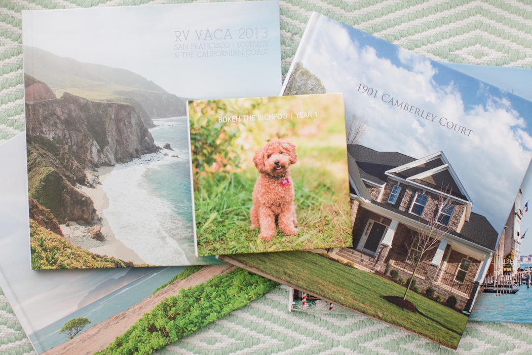
- How big is it?! Well, the last two years I have overdone it. I actually have created over 400 pages and two volumes. NORMAL people wouldn’t do this. They would probably have a 100-150 page book. I’m excessive and I know it!
- What size is your book? It’s a 12×12 photo book!
- Where do you get it printed? BLURB! With Standard Pages!
- What album are you using to design your spreads? Smartalbums and I LOVE this program!!!
- Do you do one album per year or per kid? Just one album! It’s too overwhelming to try and divide up images per kid. I can’t imagine how I would make that work!
In this Youtube Episode, I’m going to be taking you through the thought process behind piecing together my Family Yearbook Spreads. There are so many aspects of this process that are just second nature to be but I actually really enjoyed breaking it down and thinking through WHY I made certain decisions and what visual patterns I was paying attention to!
Overall, here are some design tips that I shared in the video! ….
When designing album spreads, I’m looking for:
- Variety of pulled back and tightly cropped shots
- Simple groupings (not too many images on one spread)
- Images that can fit over the spine and not get lost in the crease!
- Images that share similar color patterns
- Out of a group of related images, I look for a dominant photo or a dominant pattern (ex: One bold image to be big and the focal point or a dominant pattern like using all verticals)
There are so many other tips shared in this episode! If you find it hard to comprehend what I just listed out, be sure to watch this video to see real examples of them in action!!! Enjoy!
.