…. but after a while, I realized that I didn’t see that as “timeless”. I look back on those images now and think “hmmm… I don’t know if I like that anymore”. My style is clean and crisp and TIMELESS. That’s the key word right there… I want my images to be TIMELESS. When I look back at some of my albums 10 years from now, I don’t want my images to look “out of date”. I don’t use vintage actions or complex editing techniques, I want it to look natural. This is just what I want for ME….so if you’re a vintage-y photog, you keep doing your thang!! This is all just a matter of preference!
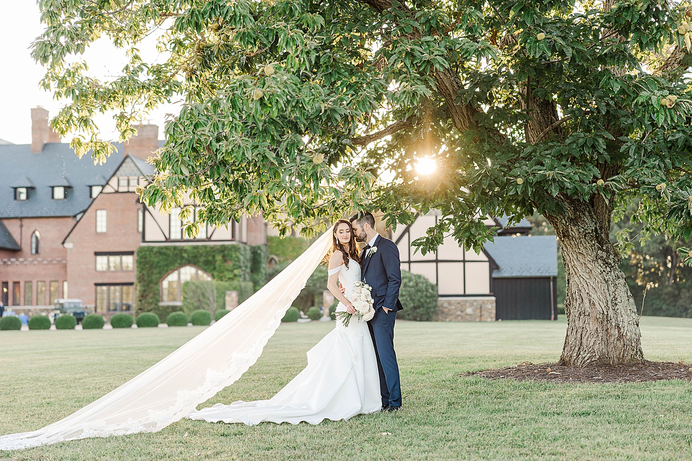
So after several different phases of B&W editing… I’ve finally come to realize that I just love the basics. I love black and white that is crisp and classic. Like this image of Stephanie and Andrew shown below. It’s the perfect example of what I want my B&W’s to continuously look like! Some still have a little warmth added to them so that they don’t look blueish at all, but for the most part, my “sepia” days are over.
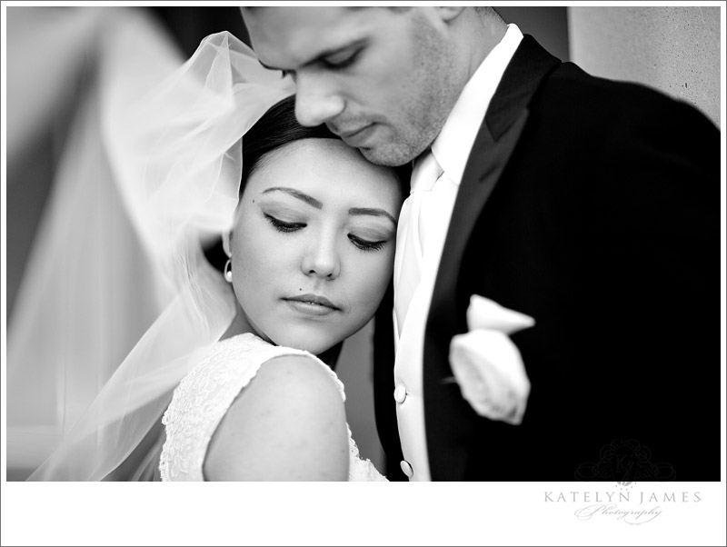
 Here is an image from 2010! I LOVE this shot of Anna and Justin! Two of my favorite people!!! However,this shows the difference in my B&W’s. This was taken LAST June and my style has changed since then!

AH! This is me being REALLY vulnerable!…. HERE is a sepia image from 2009! WHEW!!! Throwback. This was back in the day when I thought that COLORED LOGOS were COOL!!! Omg. Britt and Ryan I have to apologize. The coral logo was definitely a bad choice! This was also taken back when I was “Inspired Designs”. We refer that to that time period as the “good ol days”. So! If you notice, this image from 2009 is not only is the image sepia toned, the contrast is REALLY over the top!! I’m so thankful that I have gradually learned how to edit more naturally.
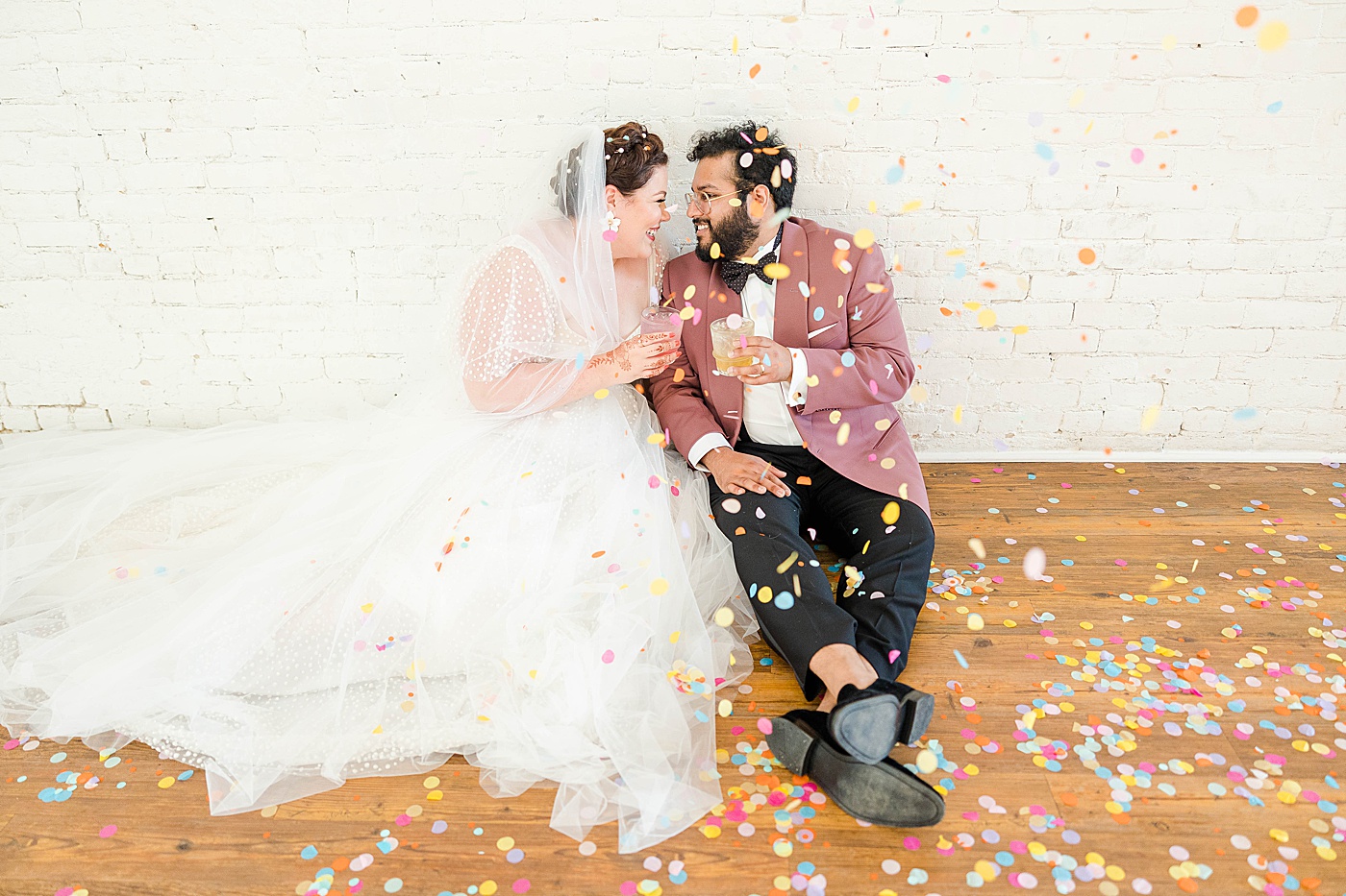
 Isn’t that CRAZY how different those three images are?! I like to call it my “Evolution of B&W”. I think I’m finally getting it now. I have found what I love and I’m sticking to it! The same goes for ALL of my images, not just the black and white. My colored images have remained pretty consistent that last few years. It was just my b&w’s that really needed some help! Here are some images that I have shot recently… trying to get my act together!


 Ps. Matt and Clare are featured on the Bride’s Cafe today!! Check them OUT!:)
 So if you’re a new photographer, trying to find “your style” and getting frustrated….. just give it some time and PRACTICE. Obviously this didn’t happen for me overnight! It took time to develop my “look” and make it consistent!! I hope this is somewhat encouraging and helpful!! Don’t go telling people I used to have multi-colored LOGOS!!!