So there are a few things that Jen and I really wanted to focus on when designing my blog. I know that there are certain aspects about my blog that people love more than others! So, we designed it in a way that made it easier for them to find those posts. Here are FIVE WAYS that we specifically focused on navigation and allowing users to easily find the content they are looking for! :
- We reorganized and totally redesigned our CATEGORIES! I had SO many categories and it was out of control! So, I narrowed down my categories into FOUR MAIN SECTIONS and then we created sub categories! So I realized that my content can fit under either “Personal, Weddings, Business, or Education”. ALL of my many categories are now organized under a MAIN category! This looks so much cleaner!!! We’re working on getting mobile to cooperate as well.

- We selected some of our favorite, most popular categories and we added them on the left sidebar of our “open post” layout! If someone is new to our site, they will quickly see what everyone else loves about our blog!

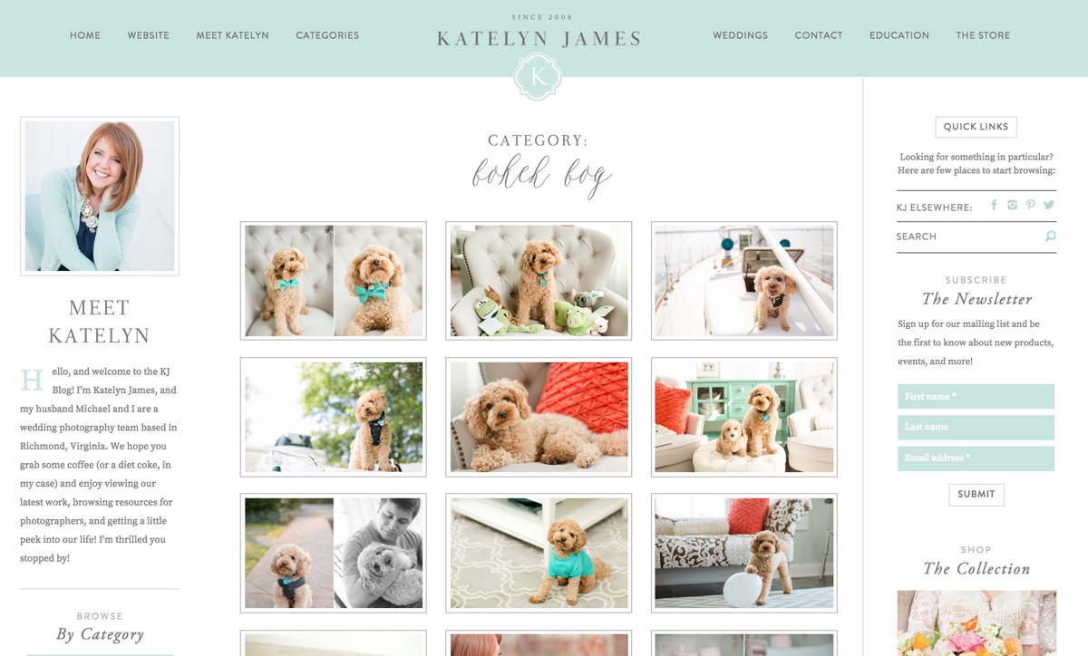
- We added a GRID system! When someone goes to our fancy new “Categories” drop down from the main navigation bar, they will be taken to a new “GRID” page where you can hover over images and see the post title! We’re still working on converting some old posts but we’re getting there! Slowly but surely!!! I LOVE this new feature because it’s SO easy to find specific posts and I don’t have to use the “SEARCH” feature! I ALSO love it because SOMEONE got their very own category!!!! BOKEH BOY!!! If you ever need a whole lot of FLUFF in one place, now you have it!

- Sticky Nav Bar! That sounds weird… but it’s really what the web world calls it! Our Navigation bar sticks to the top of the page so that viewers can ALWAYS find what they are looking for…. they don’t even have to scroll to the top!

- The “Browse By” bar! We added an EXTRA navigation bar under the main header to allow viewers to have an additional place to search for what they are looking for!

If you’re about to redesign a blog, hopefully these ideas were helpful or at least got you thinking about how you can make your blog a little more user friendly!!! Special thanks to JEN and FLOSITES for being BRILLIANT and helping these crazy ideas come to life!